The Narrative:
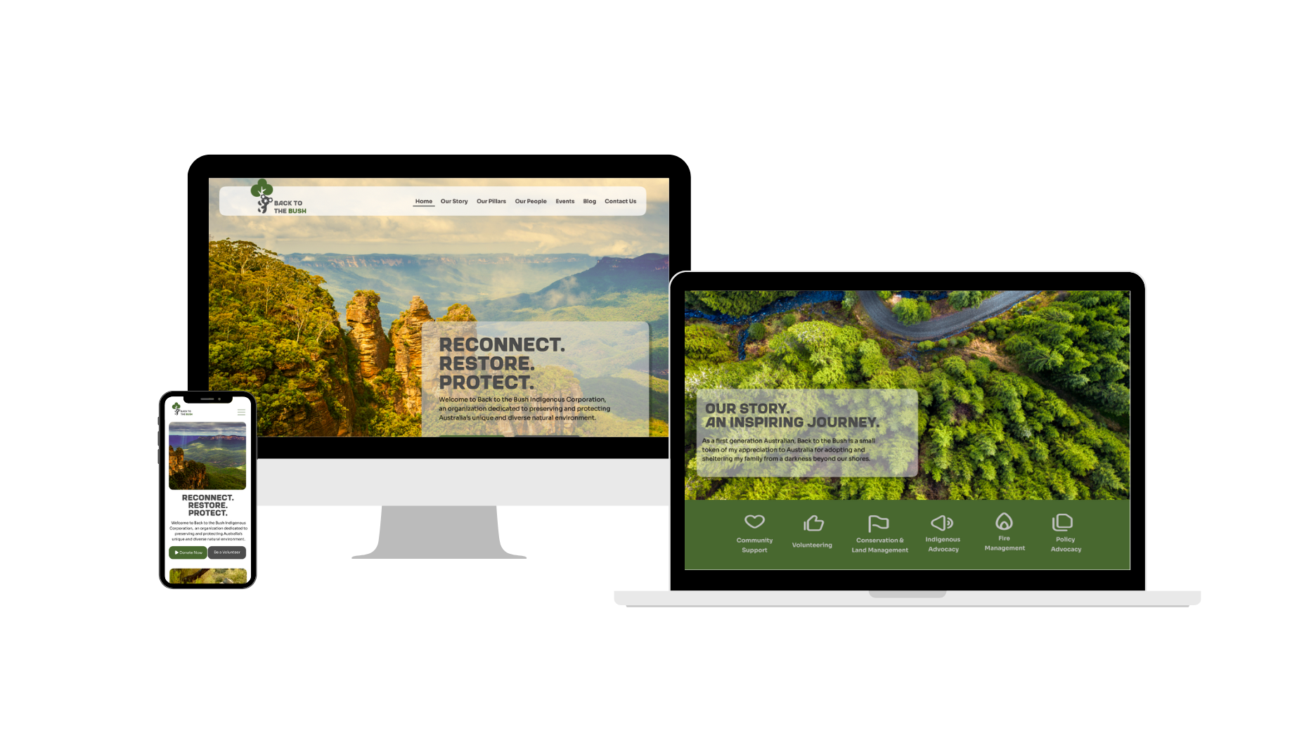
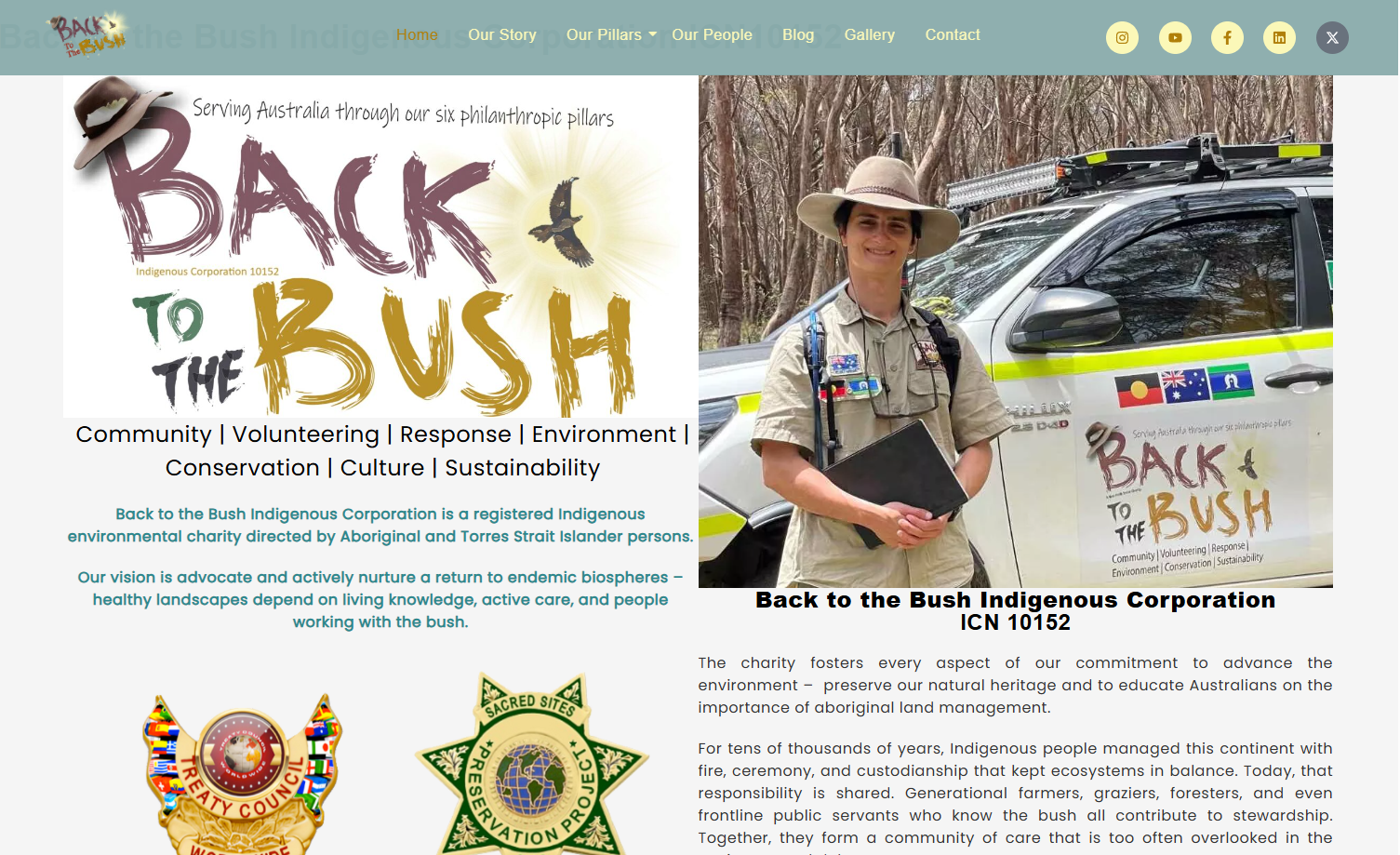
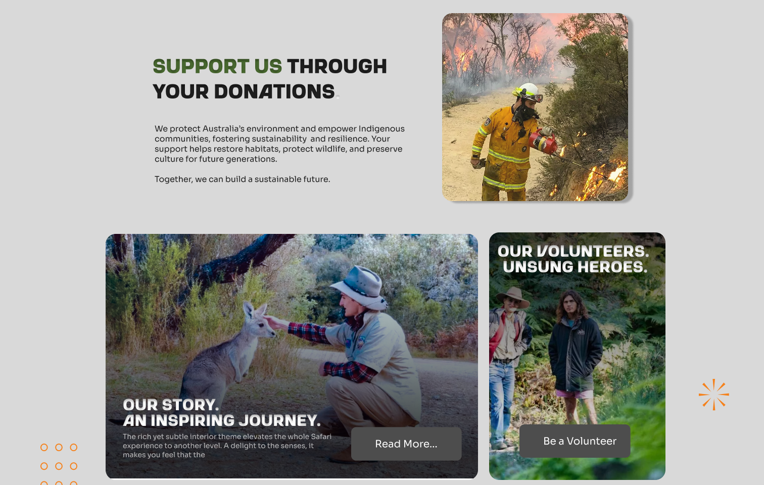
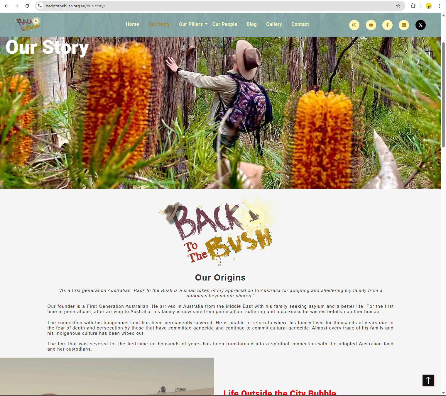
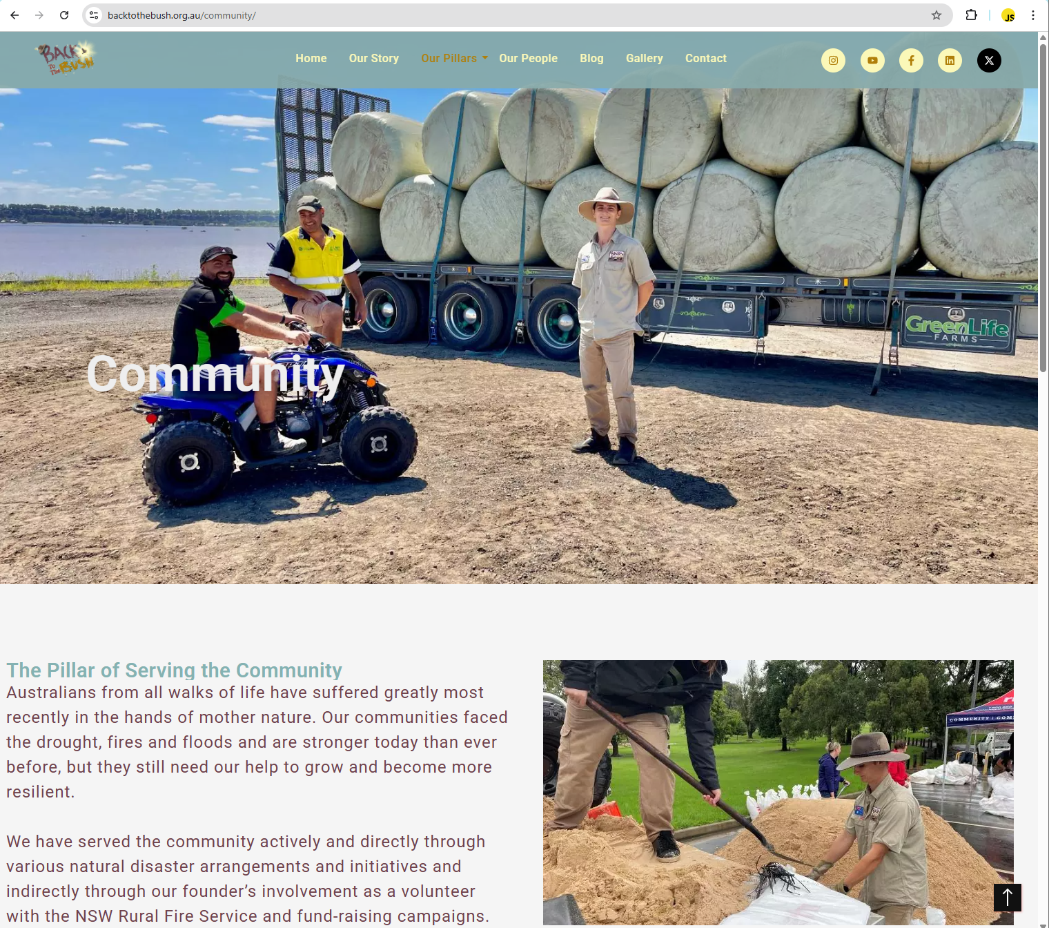
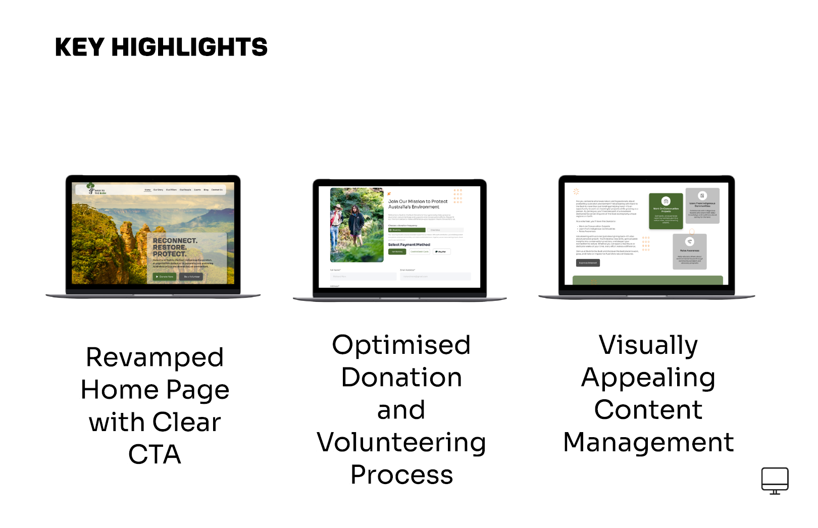
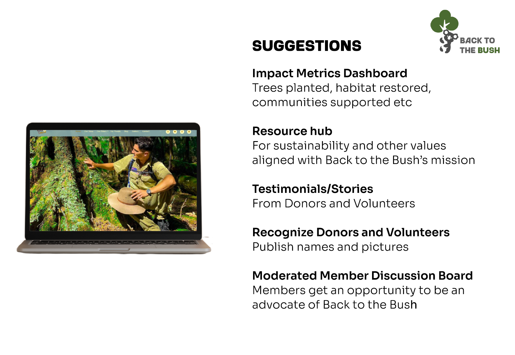
Digitizing the outback spirit requires more than a standard interface. It demands a digital campfire where community and commerce meet. For this project, the technical logic focused on high-impact storytelling and streamlined navigation for low-bandwidth environments. We built a platform that honors the grit of rural Australia, ensuring the local soul remains visible in a global digital landscape.
UX Workflow
A structured approach to transforming insights into impactful design solutions.
Discovery
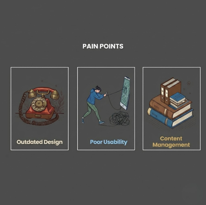
Our discovery process bypassed traditional field research in favour of intensive stakeholder interviews and comprehensive desktop research.
(Hover to reveal)
(Tap to reveal)
Discovery
Sketch
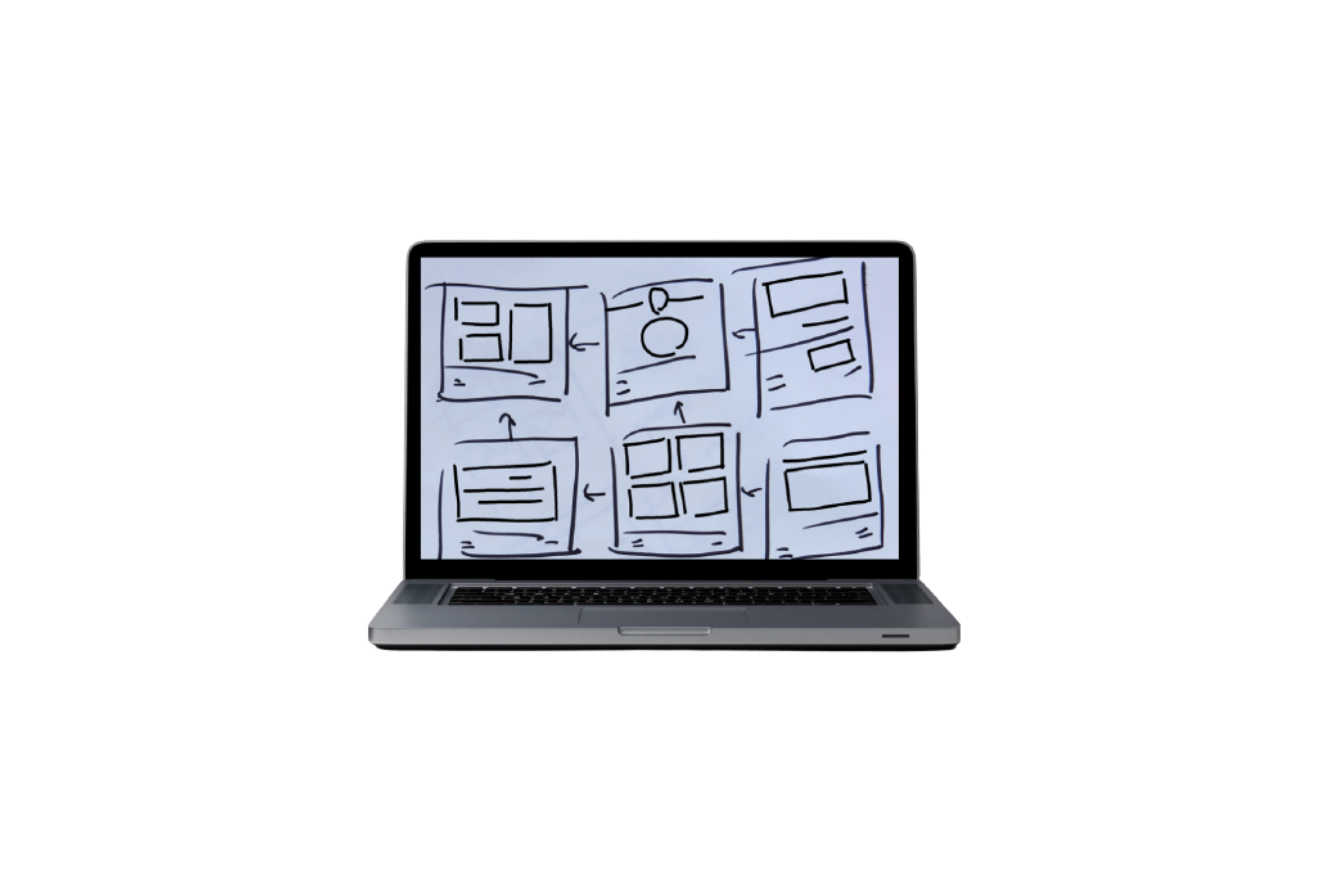
Explored low-bandwidth design patterns, sketching navigation flows that work seamlessly in areas with limited internet access.
(Hover to reveal)
(Tap to reveal)
Sketch
Wireframing
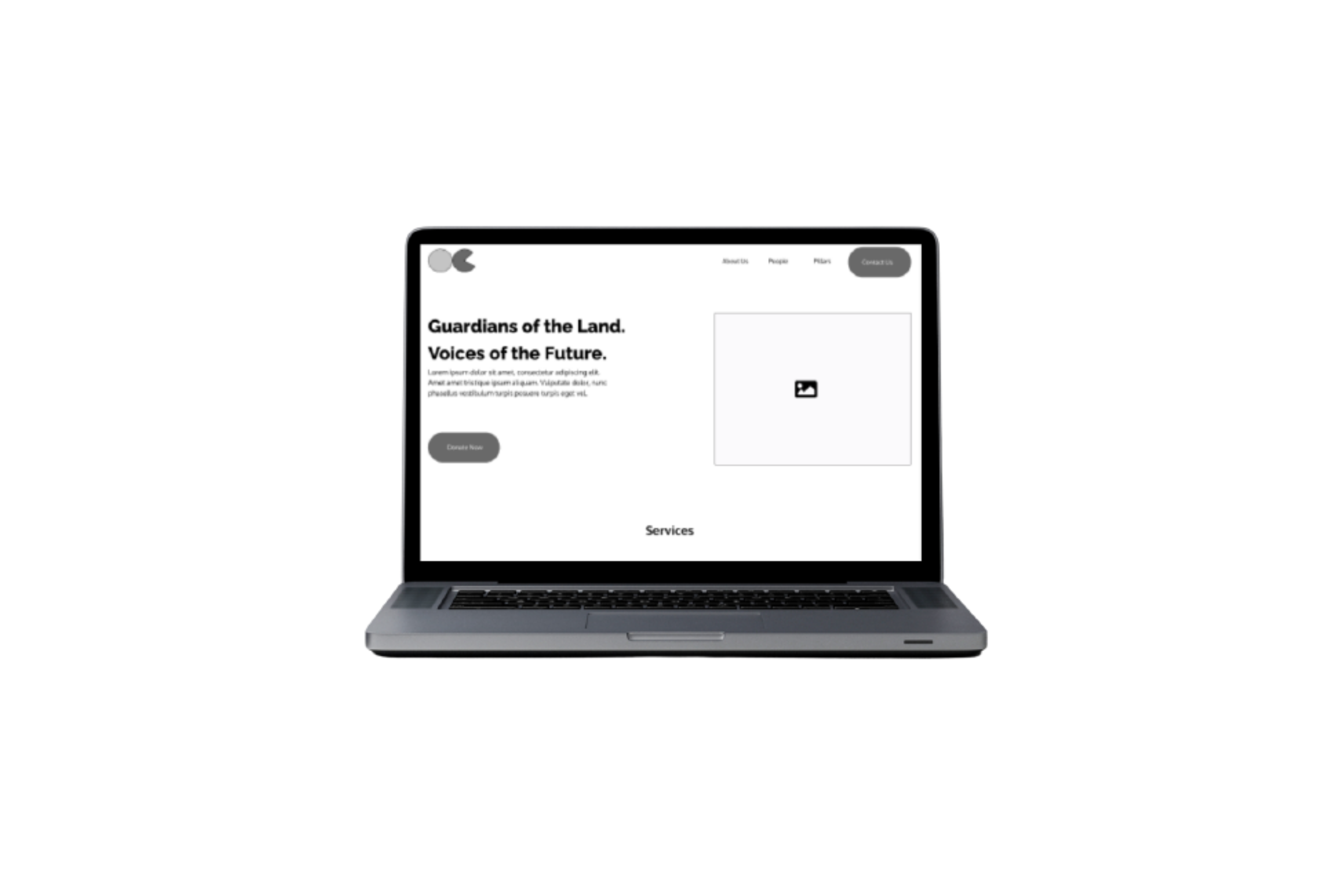
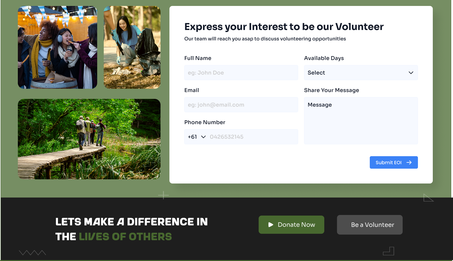
Built wireframes prioritising essential content delivery and community engagement features for the Australian outback market.
(Hover to reveal)
(Tap to reveal)
Wireframing
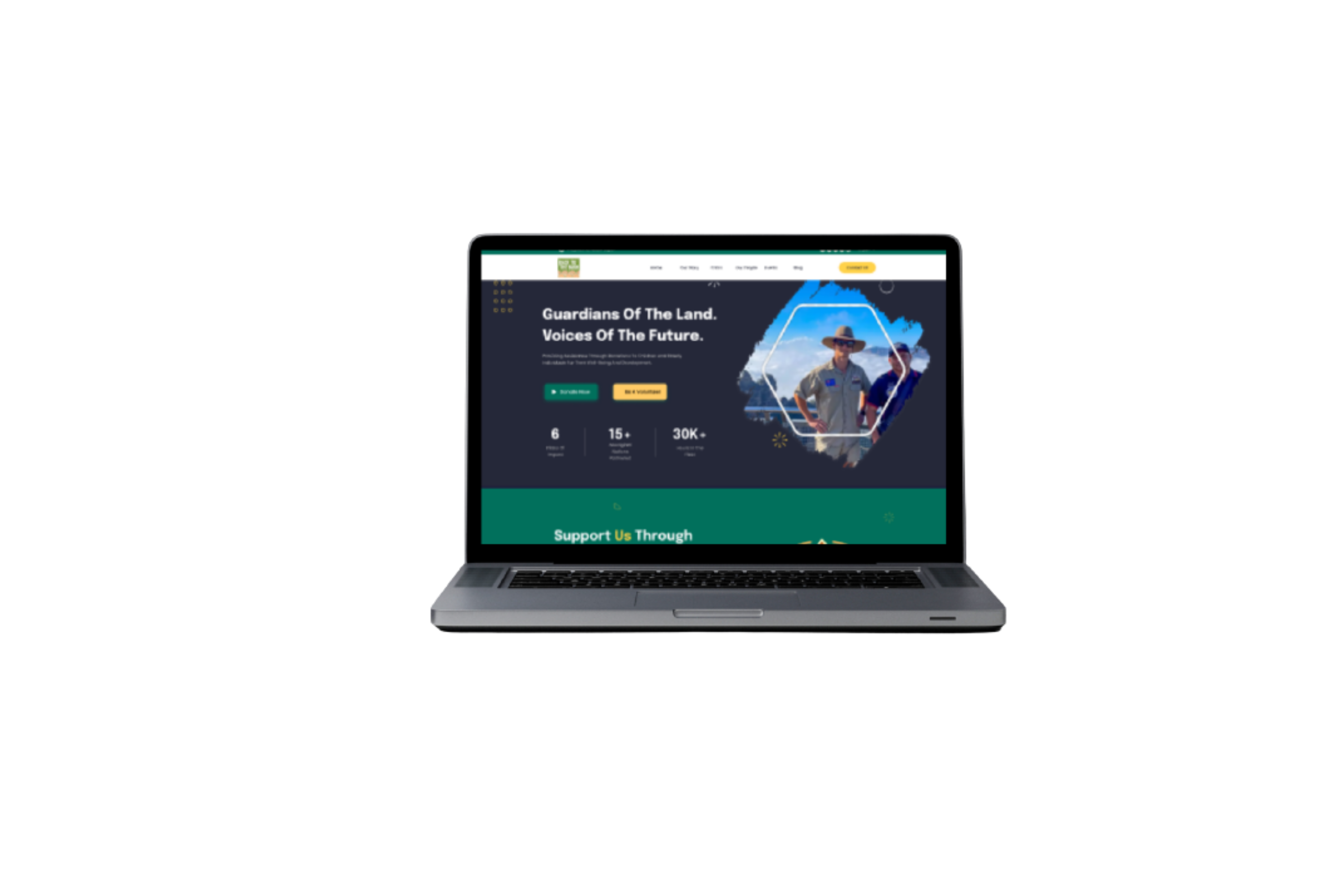
Prototyping
Developed high-fidelity prototypes tested with real users in remote communities, iterating based on authentic feedback.
(Hover to reveal)
(Tap to reveal)
Prototyping
Before & After
Drag the slider to compare the transformation. See how research-driven design creates measurable impact.

The Narrative:
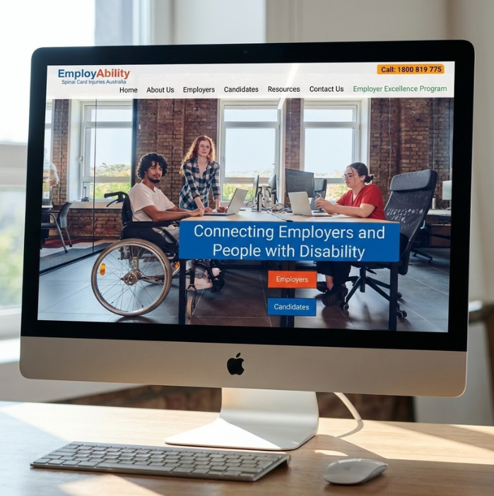
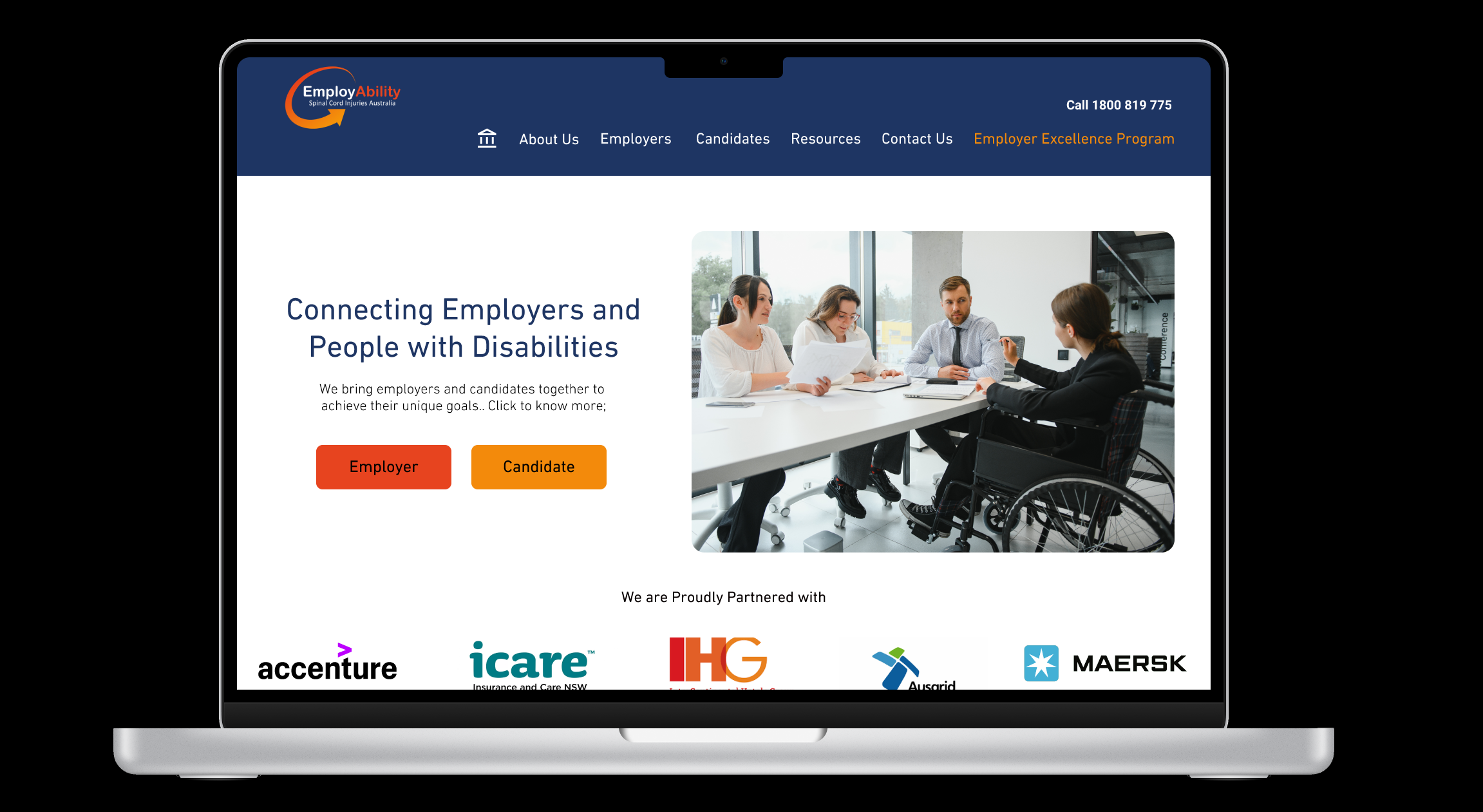
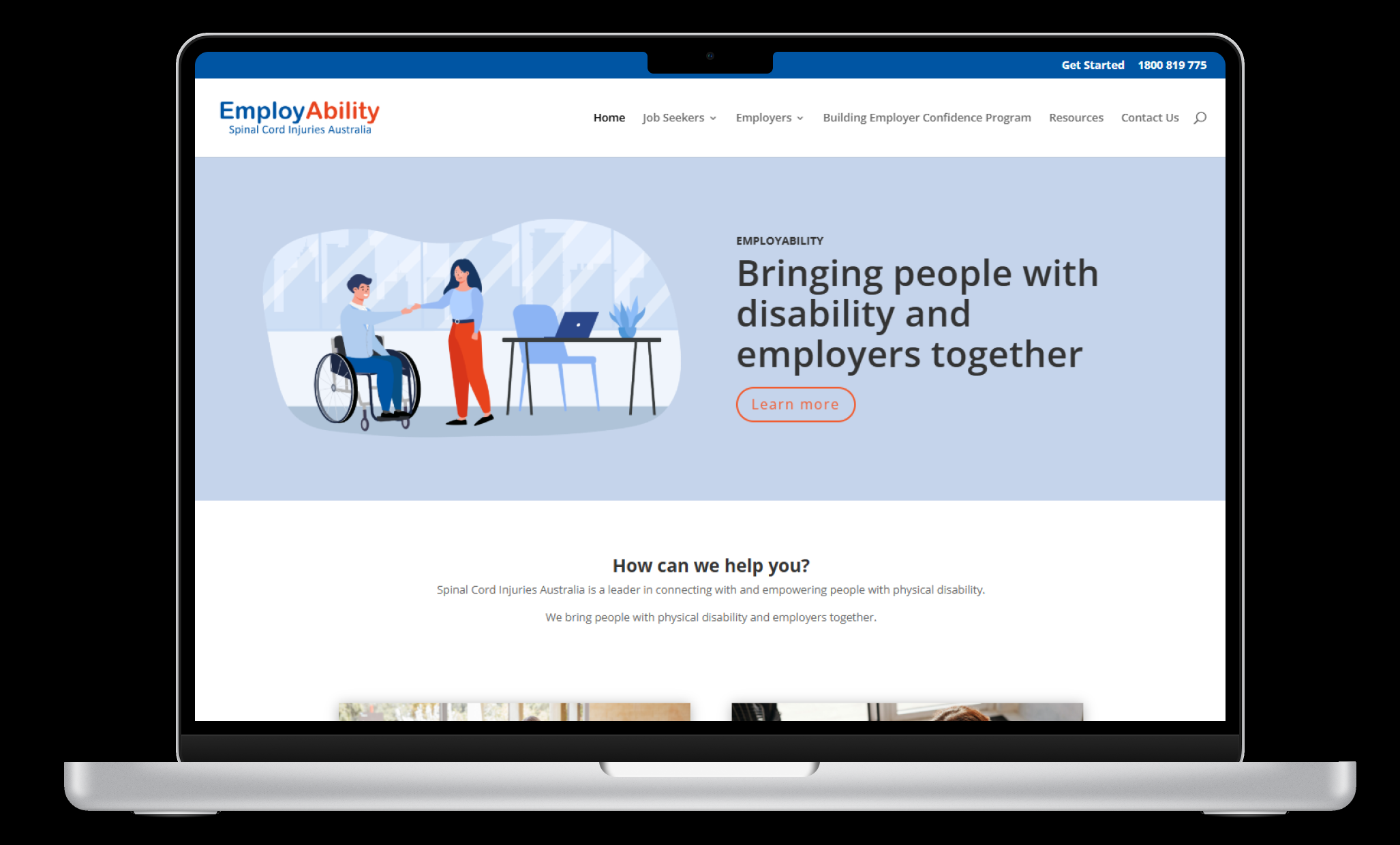
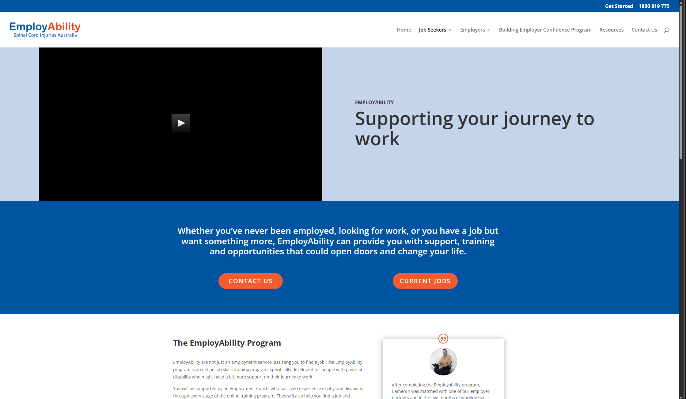
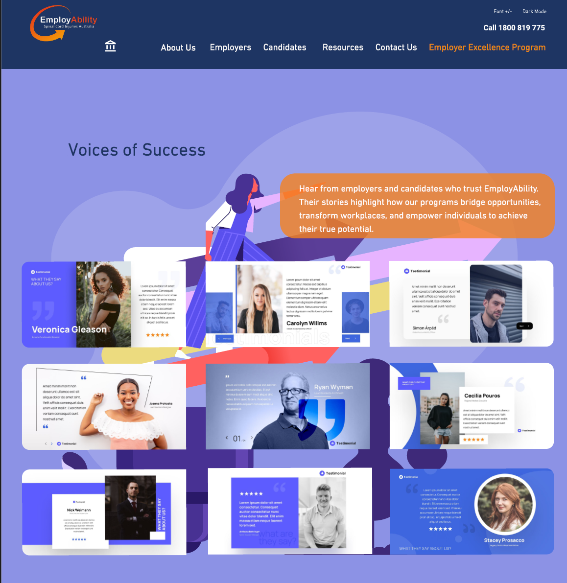
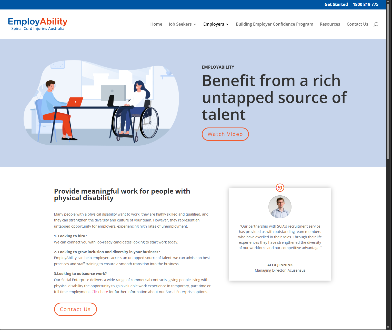
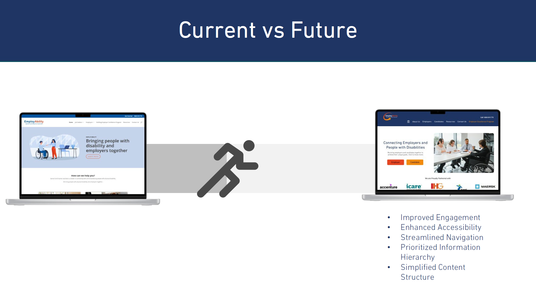
In the disability sector, technical precision is the foundation of human agency. The SCIA Employability platform was a transformation from a cold, bureaucratic legacy portal into a person-centred architecture. By distilling complex NDIS data into intuitive dashboards, we removed the technical anxiety that often blocks professional entry. This is UX design serving as a gateway to dignity.
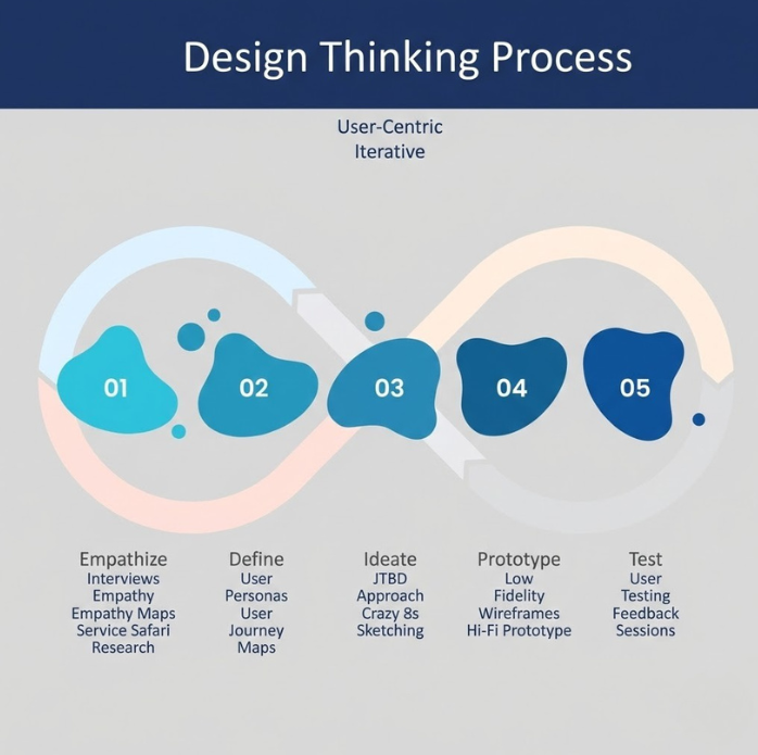
UX Workflow
A structured approach to transforming insights into impactful design solutions.
Discovery
Conducted extensive interviews with NDIS participants and support coordinators to map pain points in the existing employment portal.
(Hover to reveal)
(Tap to reveal)
Discovery
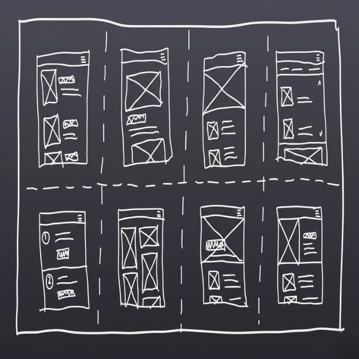
Sketch
Explored accessible design patterns, sketching interfaces that accommodate diverse abilities and assistive technologies.
(Hover to reveal)
(Tap to reveal)
Sketch
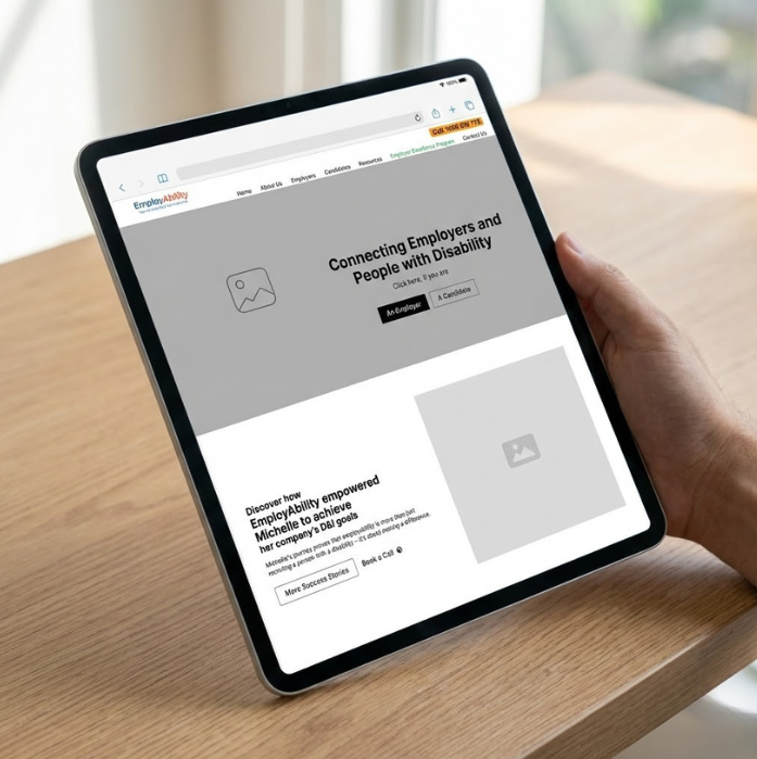
Wireframing
Built WCAG-compliant wireframes with clear information hierarchy and reduced cognitive load for users.
(Hover to reveal)
(Tap to reveal)
Wireframing
Prototyping
Created accessible prototypes tested with real NDIS participants, ensuring the platform serves those who need it most.
(Hover to reveal)
(Tap to reveal)
Prototyping
Before & After
Drag the slider to compare the transformation. See how research-driven design creates measurable impact.

The Narrative:
Revard App: Gamifying discipline requires a delicate balance between parental boundaries and childhood motivation. The Revard App is a dual-interface ecosystem designed to bridge that gap. The architecture focuses on a high-reward visual language for children and a clear, data-driven command centre for parents. It is a technical solution to a modern human friction: the screen-time struggle.
The Discovery
Mindmap & Research
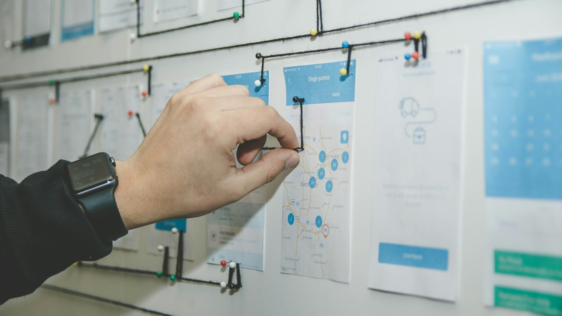
We mapped the psychology of modern parenting. Through stakeholder interviews and competitive desktop research, we identified a critical "motivation gap" in existing screen-time tools.
 The Motivation Gap
The Blueprint
Sketches & Wireframes
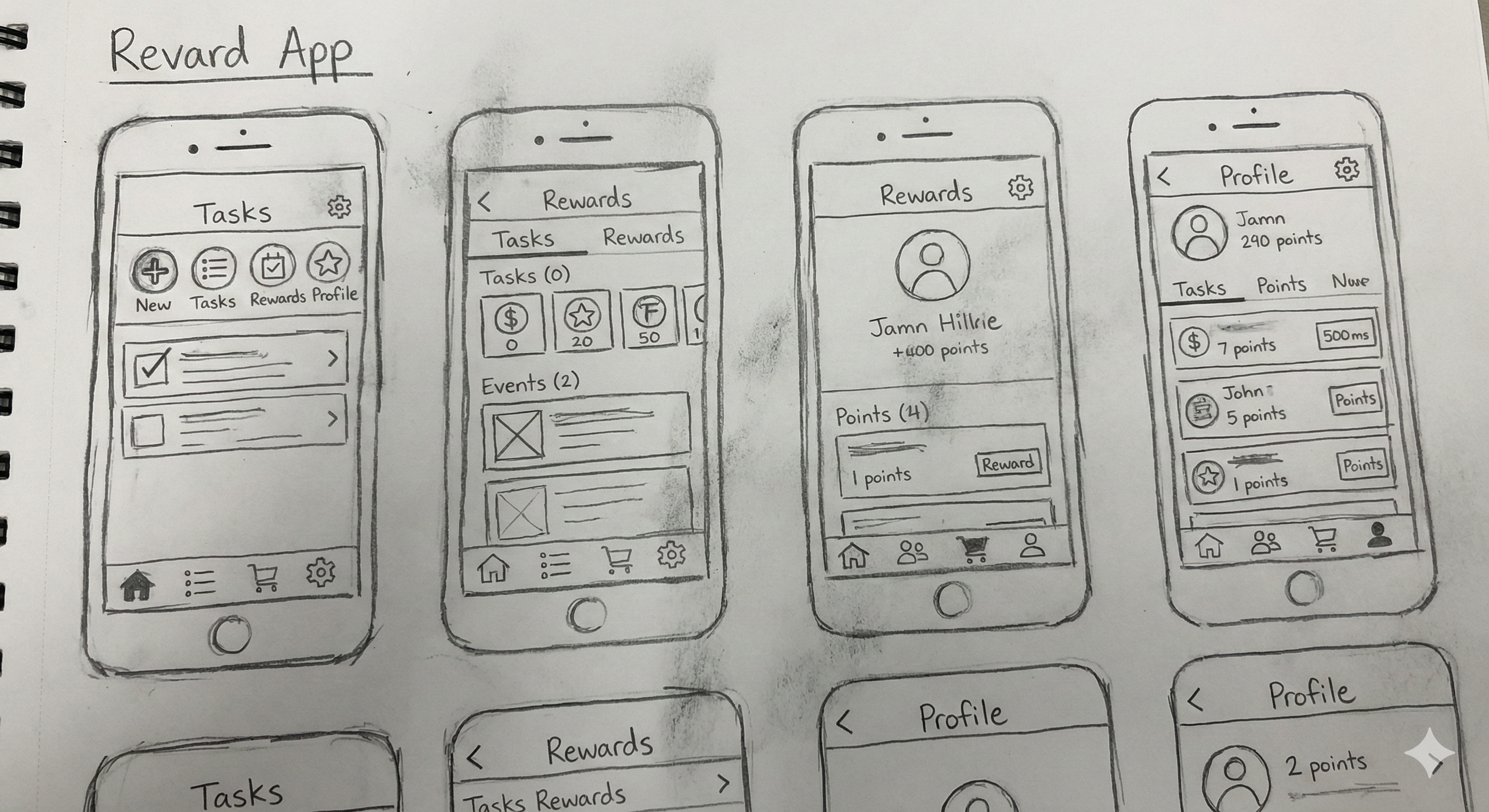
Every pixel was earned through iteration. We began with low-fidelity sketches focusing on the "Single Hand Rule" for parents and "High-Reward Visuals" for children. Mid-fidelity wireframes followed, establishing a dual-interface logic that manages complex rules without cognitive overload.
 Low-Fidelity Sketches
 Mid-Fidelity Wireframes
The System
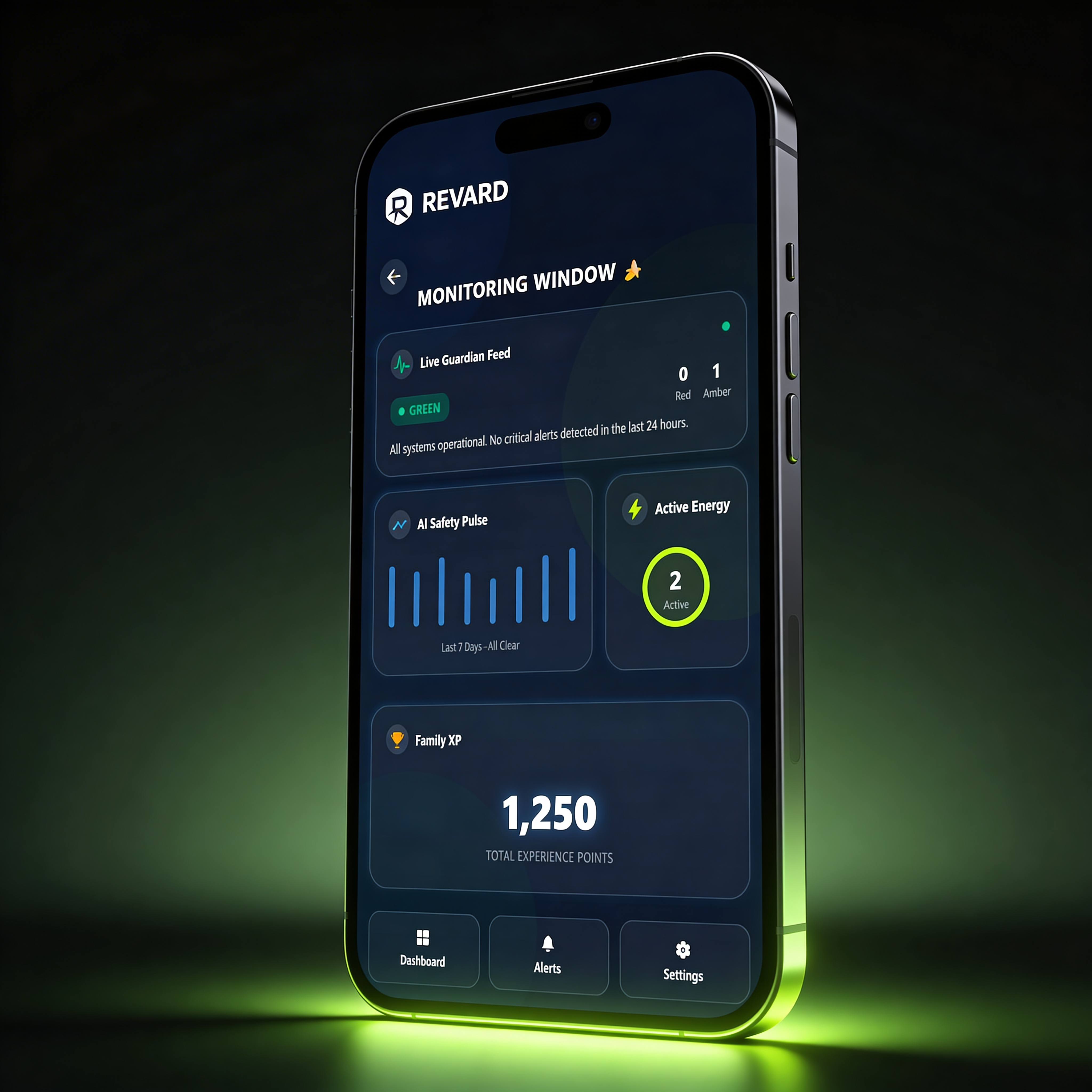
High-Fidelity UI
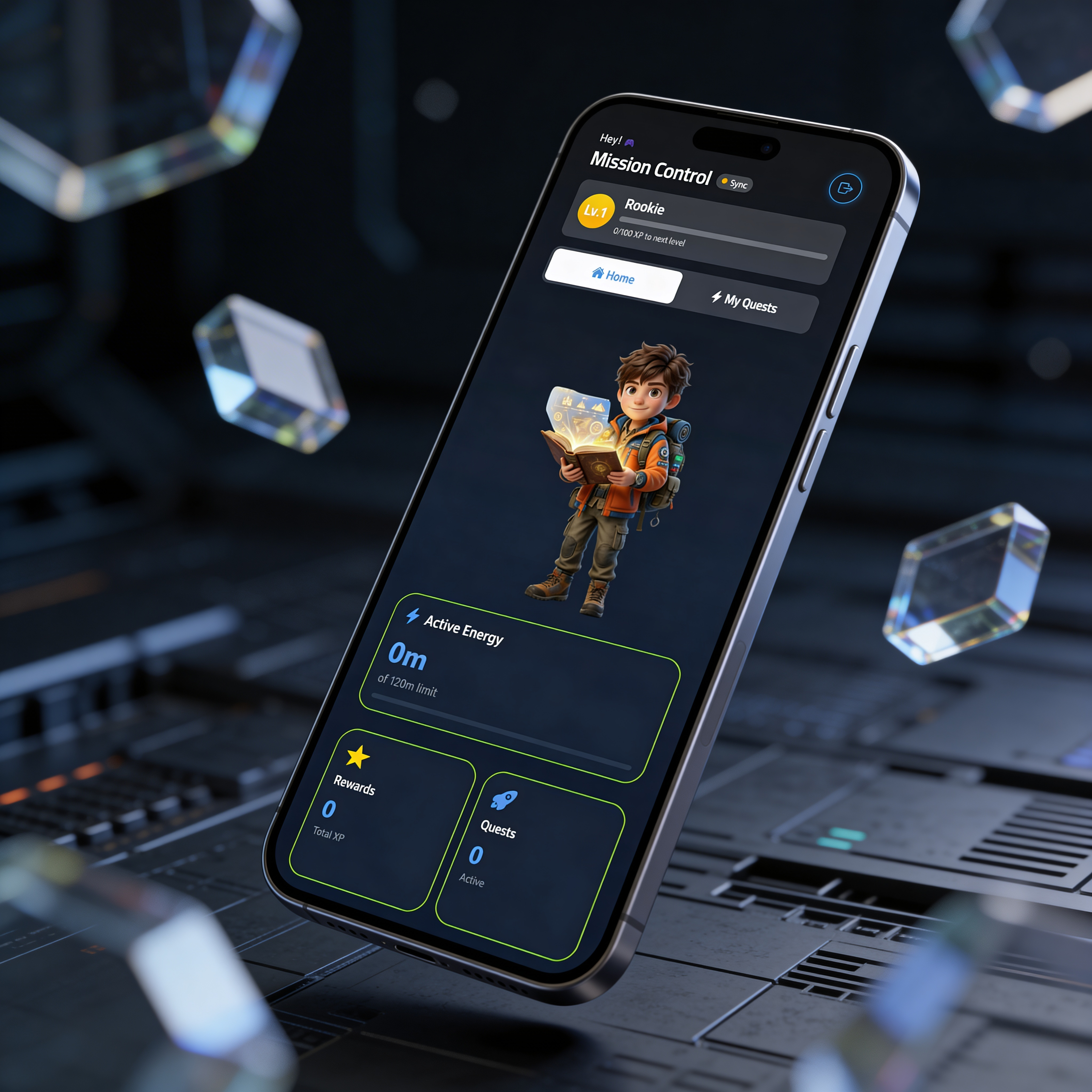
The final system delivers a seamless dual-interface experience. Parents get a command centre: children get a reward playground.

The Interaction
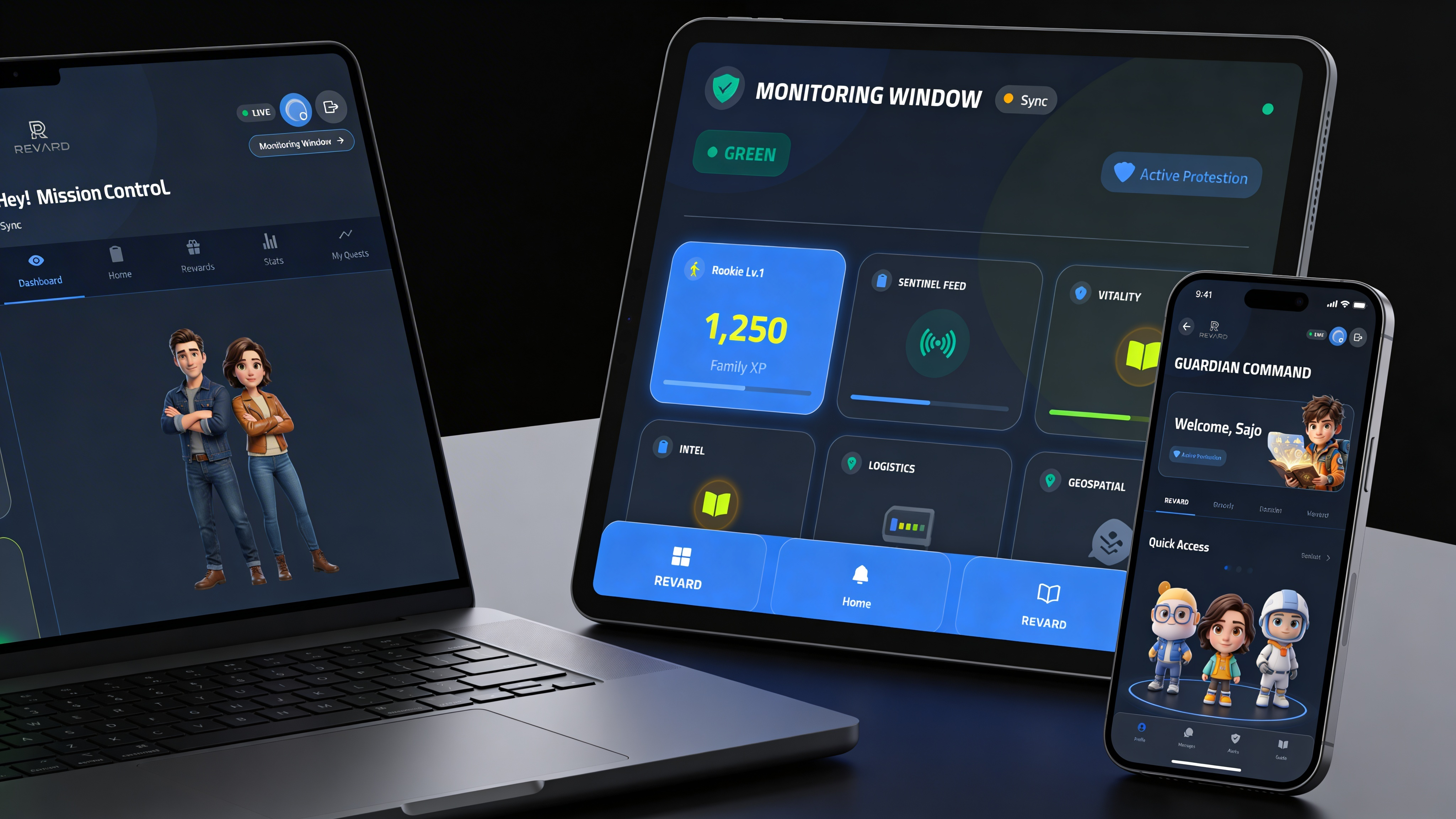
Prototype & High-Fidelity
UX is a living thing. Our interactive prototypes allowed us to test the "Micro-Incentive" feedback loop, ensuring the child feels rewarded instantly for every minute of discipline.

The Narrative:
The architecture of empathy begins with deep research into marginalized user journeys. For The Big Issue, we mapped the transition from physical street-level transactions to a frictionless digital donation flow.
The Brief
Transform the fragmented user experience of a social enterprise into a cohesive, interactive digital journey. The goal is to sustain vendor income by bridging the gap between declining print sales and modern digital reading habits.
The Scope
- UX Audit: Benchmarking global street papers and digital competitors.
- User Research: Synthesizing data from 113 survey participants and in-depth interviews.
- Strategic Roadmap: Creating a multi-phase implementation plan for digital transformation.
Research Methods
Survey Insights
Not seeing vendors or payment inconvenience
Target Audience
User Persona

Frustrations
- •Friction in physical transactions and lack of cash
- •Wants to support vendors but rarely carries cash
- •Uncertain where digital donations go
Goals
- •Make a direct, transparent social impact
- •Convenient, mobile-first digital experiences
- •Support vendors directly
The Strategic Solution
Strategic Pillars
Vendor-Linked Digital
Unique QR codes allow instant mobile wallet payments, crediting vendors in real-time.
Radical Transparency
Clear dashboards showing exactly what portion of the sale goes to the vendor.
Zero-Friction Access
No app required. A responsive, mobile-optimised web reader for instant access.
Education & Awareness
Omnichannel campaigns (Transit, Social) educating donors on cashless support.
The approach centres vendor empowerment, user trust, social impact, and frictionless digital convenience: positioning The Big Issue for sustainable, scalable impact in the digital era.