Back to the Bush
The Brand Brief
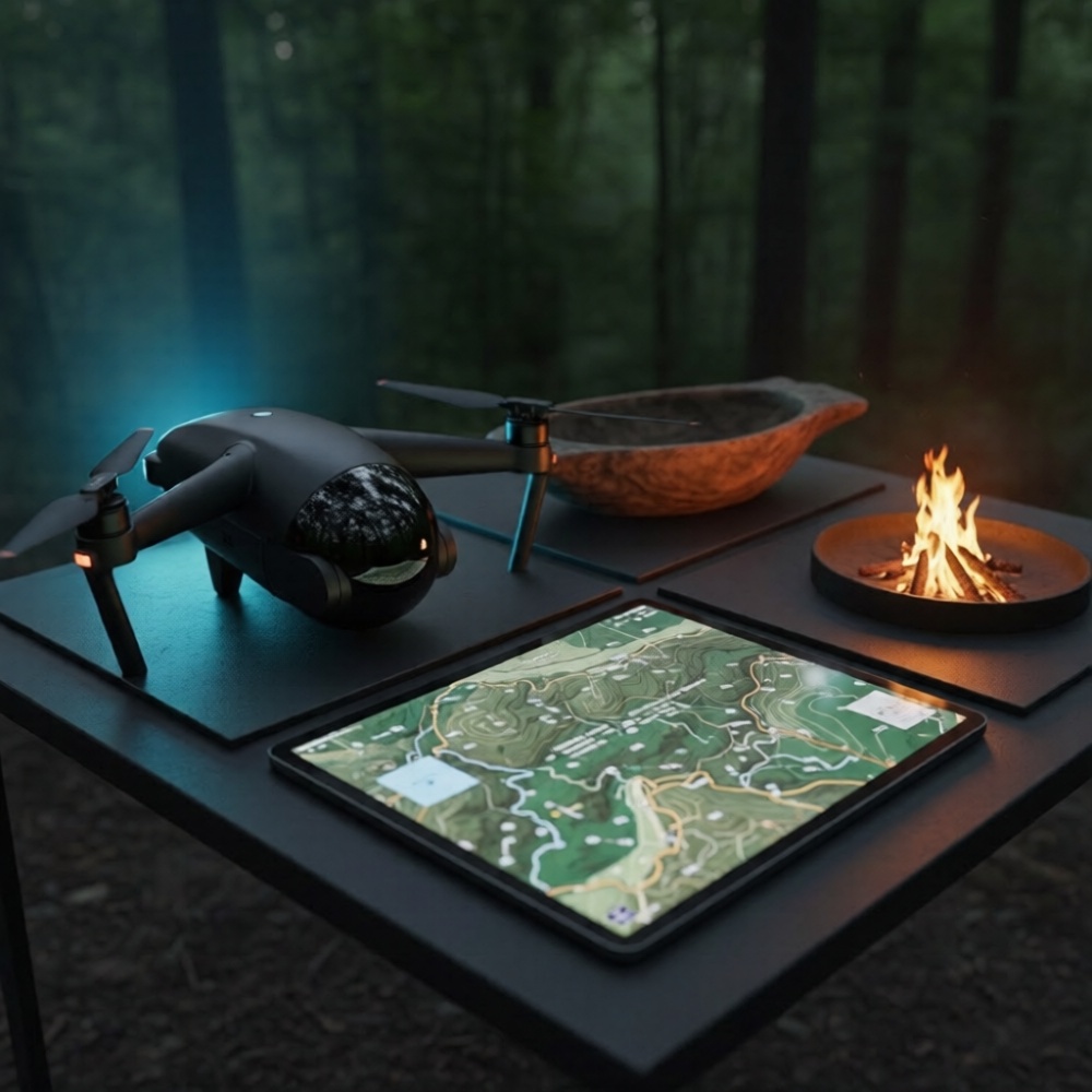
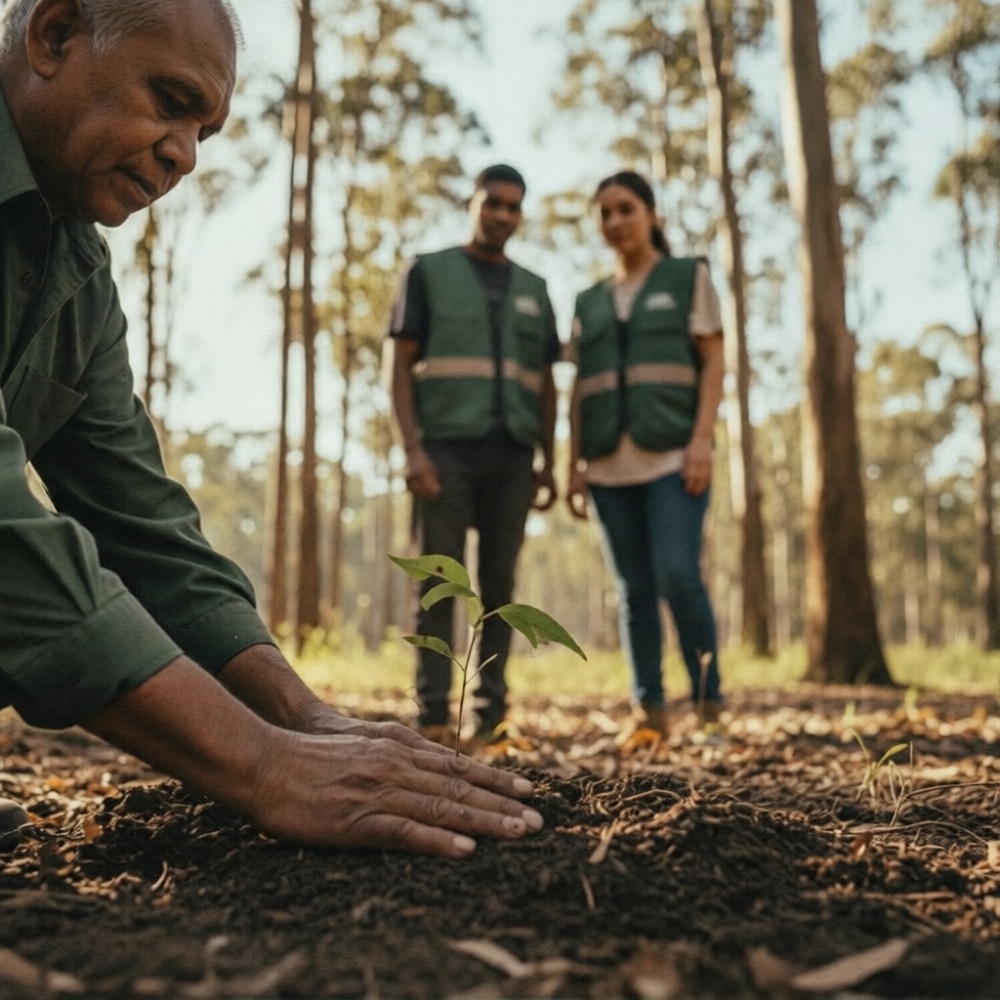
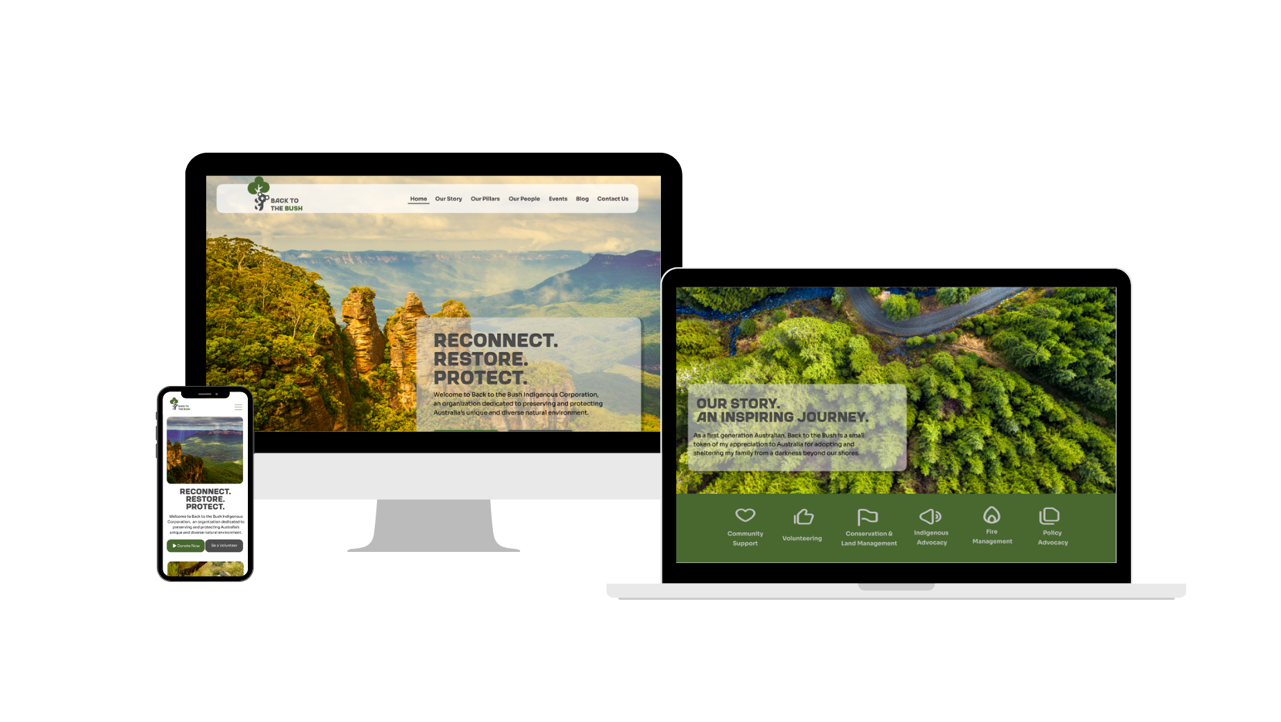
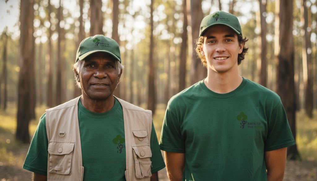
The Mission of Restoration: Australia's natural landscape is not just a backdrop; it is our heritage and our future. At Back to the Bush Indigenous Corporation, they are dedicated to preserving and protecting this unique, diverse environment through a commitment to the land and its people. Their work is built on three unbreakable pillars: Reconnect. Restore. Protect.
The Philosophy of Impact: True environmental impact thrives at the intersection of traditional wisdom and modern innovation. We foster a community-centric approach, empowering volunteers to become the 'unsung heroes' of conservation. Whether through cultural fire management or habitat restoration, our mission is to drive engagement that results in a thriving ecosystem for generations to come.
Core Visual Mood

The Visual System
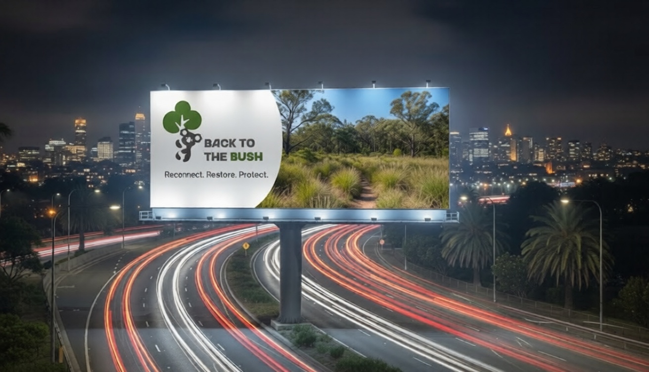
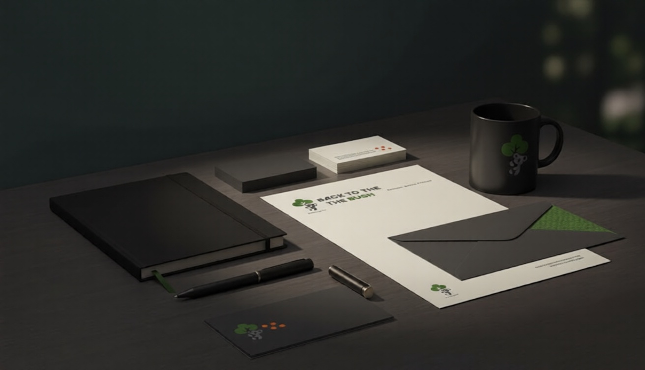
A cohesive identity system designed to work across all touchpoints.
Logo System
Brand Applications
Revard App
The Brand Brief
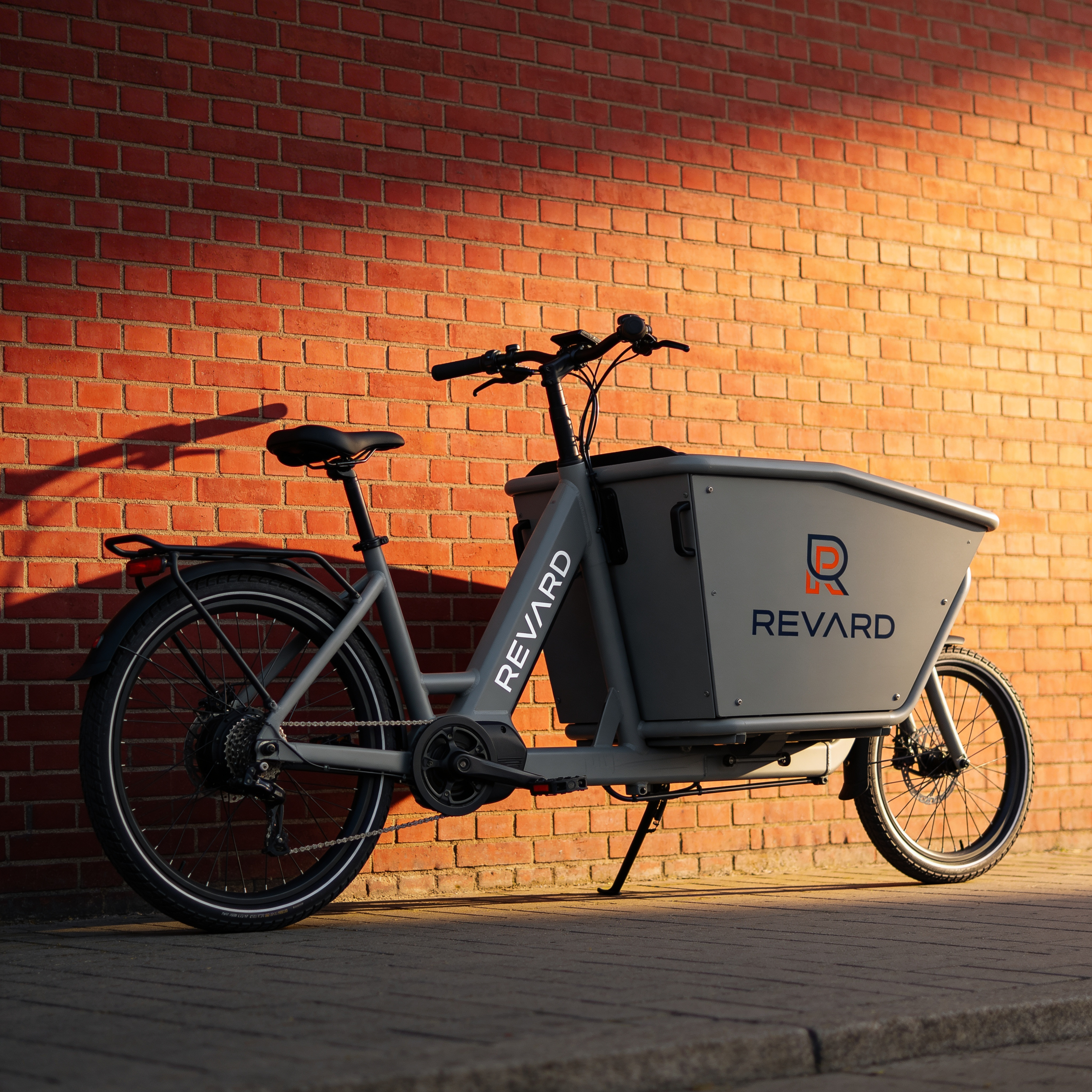
Nurturing Bright Futures: The digital world is full of noise. Building a rewards system that cuts through it requires more than just points: it requires purpose. We needed a visual language that felt both protective and empowering.
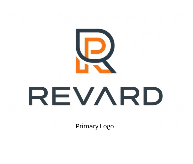
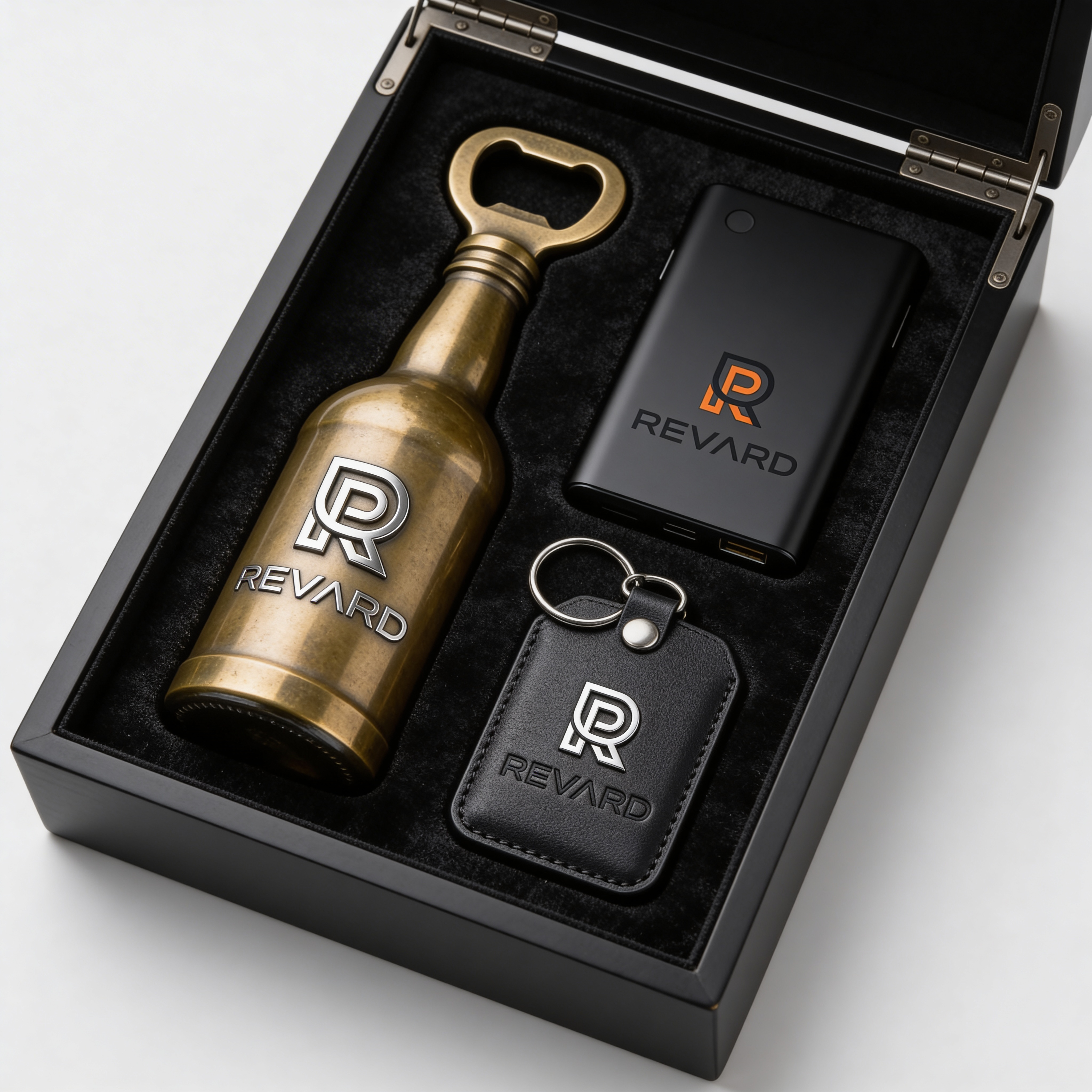
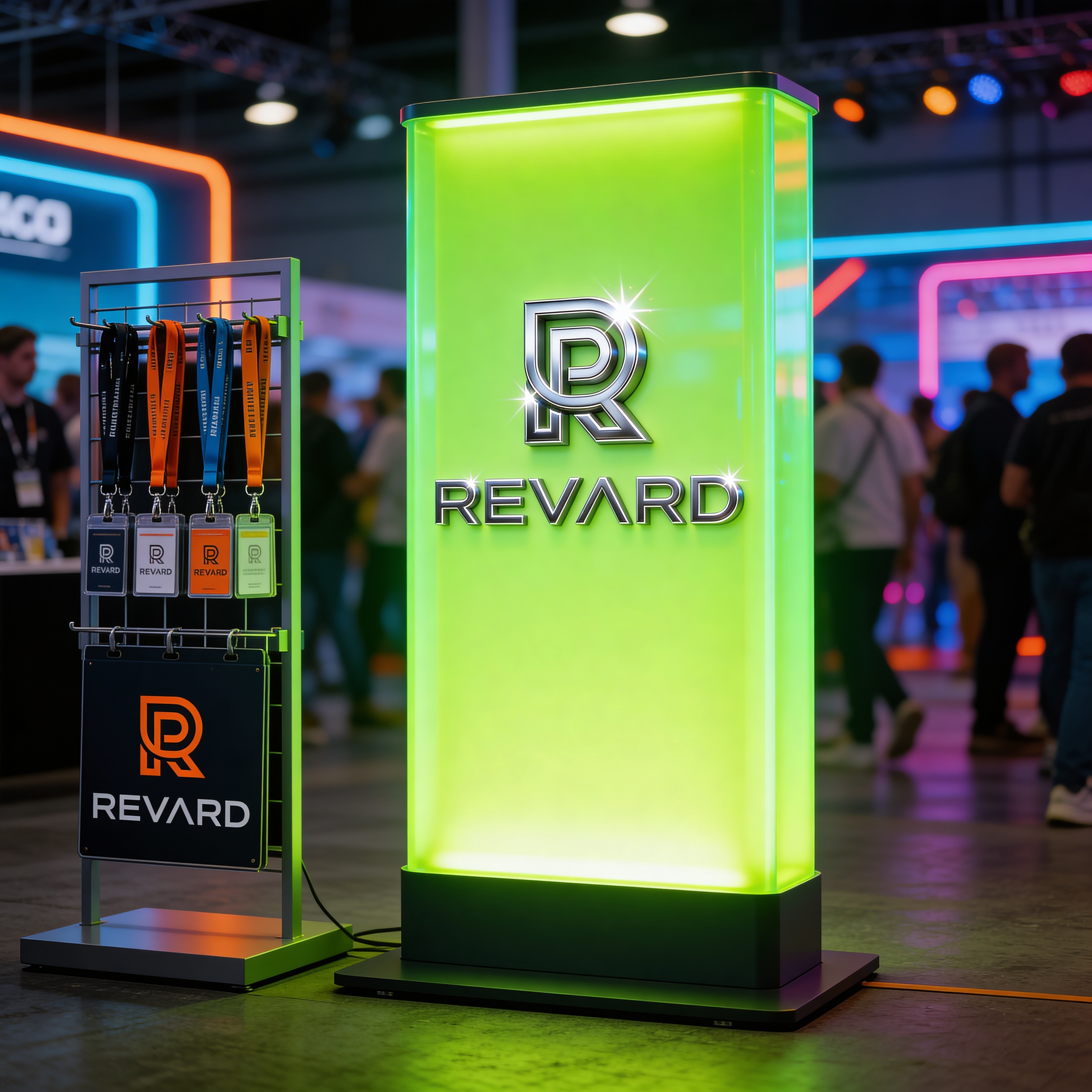
The Objective: Our goal was to create a brand that feels like a launchpad. It moves away from cold digital grids toward something that embodies movement. The identity is built around the concept of "Kinetic Growth." This is captured in our primary mark: an interlocking "R" that forms a stylised rocket trail.
Core Visual Mood



The Visual System
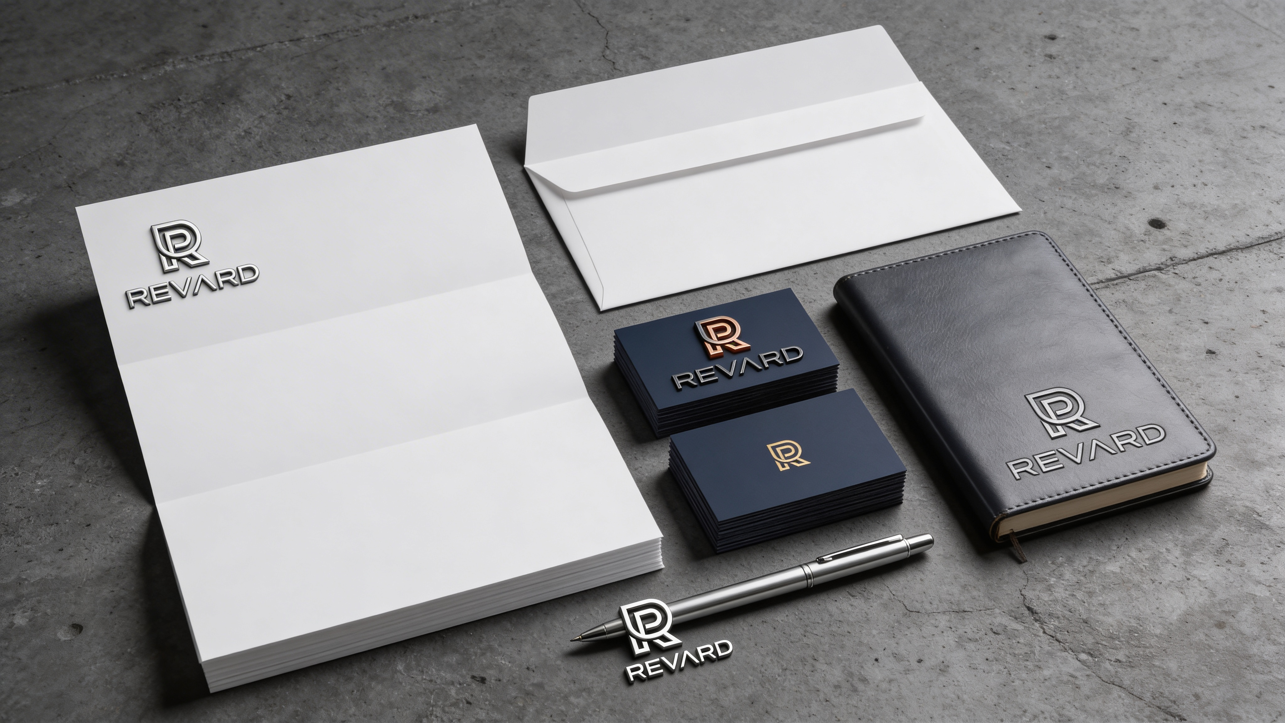
A cohesive identity system designed to work across all touchpoints.
Logo System

Brand Applications


Tech. Brand. Craft.
The Brand Brief
The Evolution of Convergence: In 2015, TBC began as a dedicated creative boutique—a collective of purists focused on the art of design. But as the digital landscape shifted, we realised that true impact doesn't live in silos; it lives at the intersection of disciplines. We expanded our realm to encompass the rigour of technology and the precision of craft.
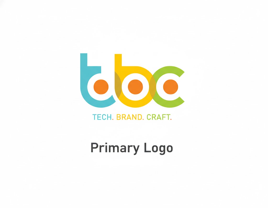
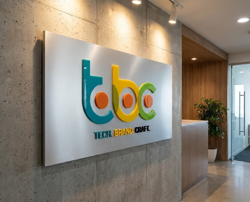
The Identity Logic: The TBC logo is a geometric manifesto. Constructed from three intersecting circles, each represents one of our pillars: Tech, Brand, and Craft. Where they overlap, they create a unified structure. The three inner dots represent the 'pulse' of the agency—the human insight that drives every pixel, line of code, and strategy.
Core Visual Mood


The Visual System
A cohesive identity system designed to work across all touchpoints.
Logo System
Brand Applications

Mufagro Fresh
The Brand Brief
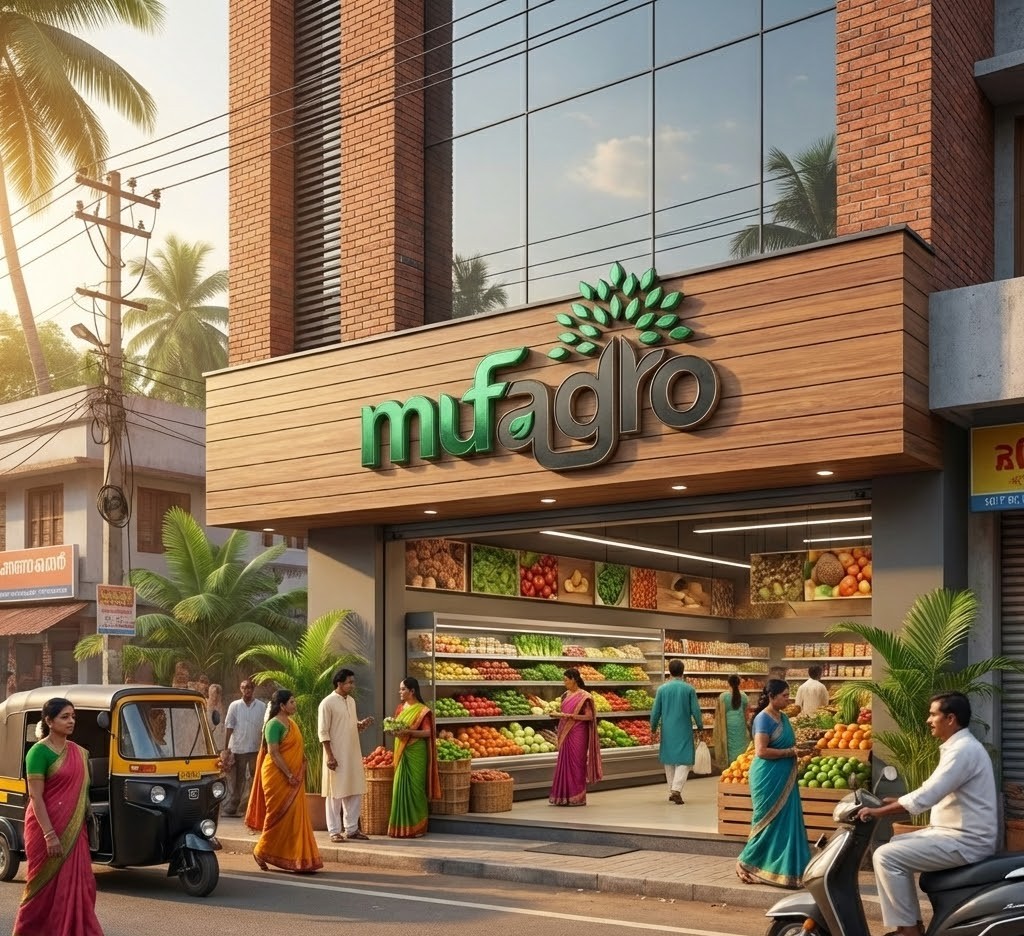
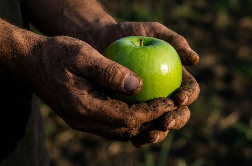
The Roots of Rebellion: Mufagro did not begin as a grocery store; it began as a movement to dismantle the walls between the grower and the eater. The mission was simple: protect the farmer from exploitation and the consumer from inflation.
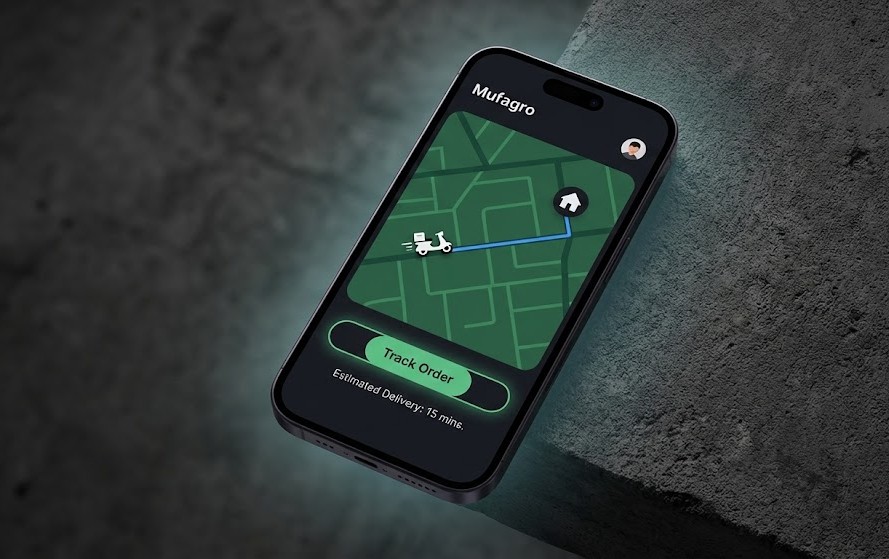
The Evolution of Freshness: What started as a handshake between the plough and the plate is now an omnichannel ecosystem. Today, Mufagro delivers personal needs and household essentials with the same rigour they apply to sourcing grain. They do not just sell vegetables; they sell the dignity of the producer and the health of the consumer.
Core Visual Mood

The Visual System
A cohesive identity system designed to work across all touchpoints.
Logo System


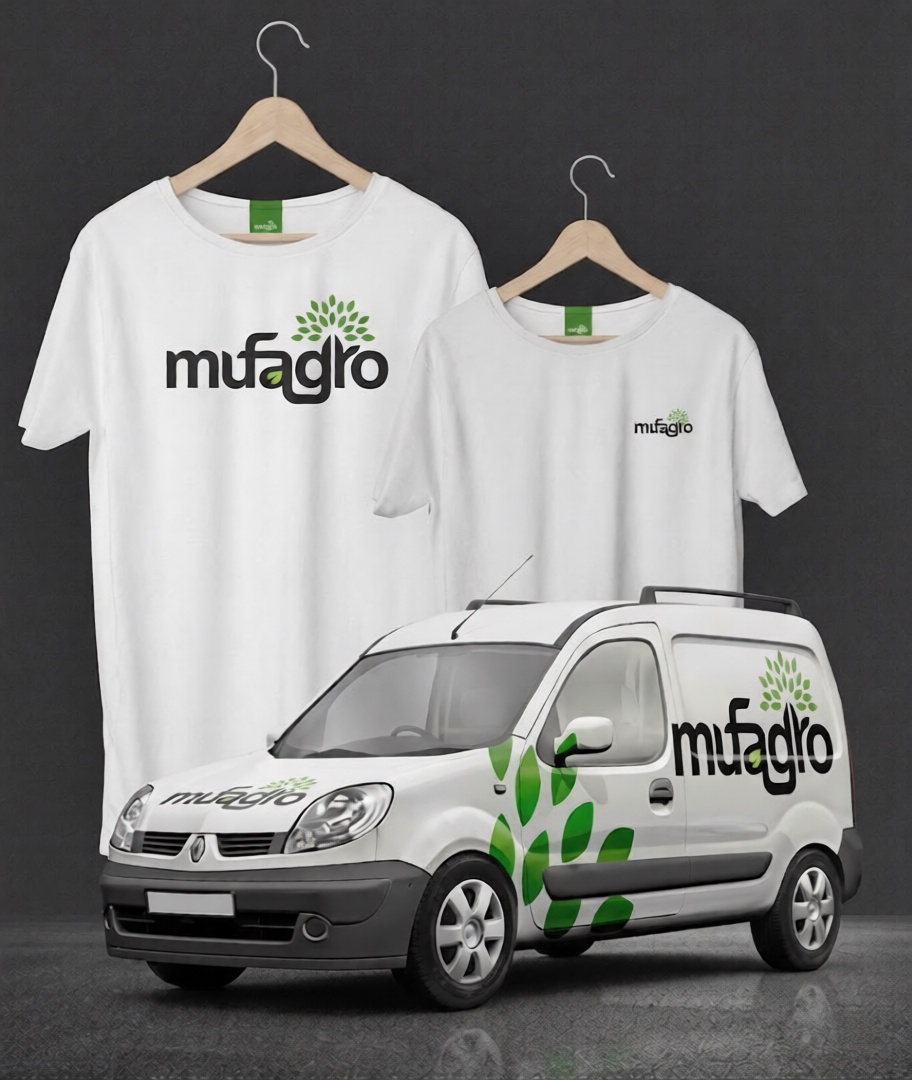
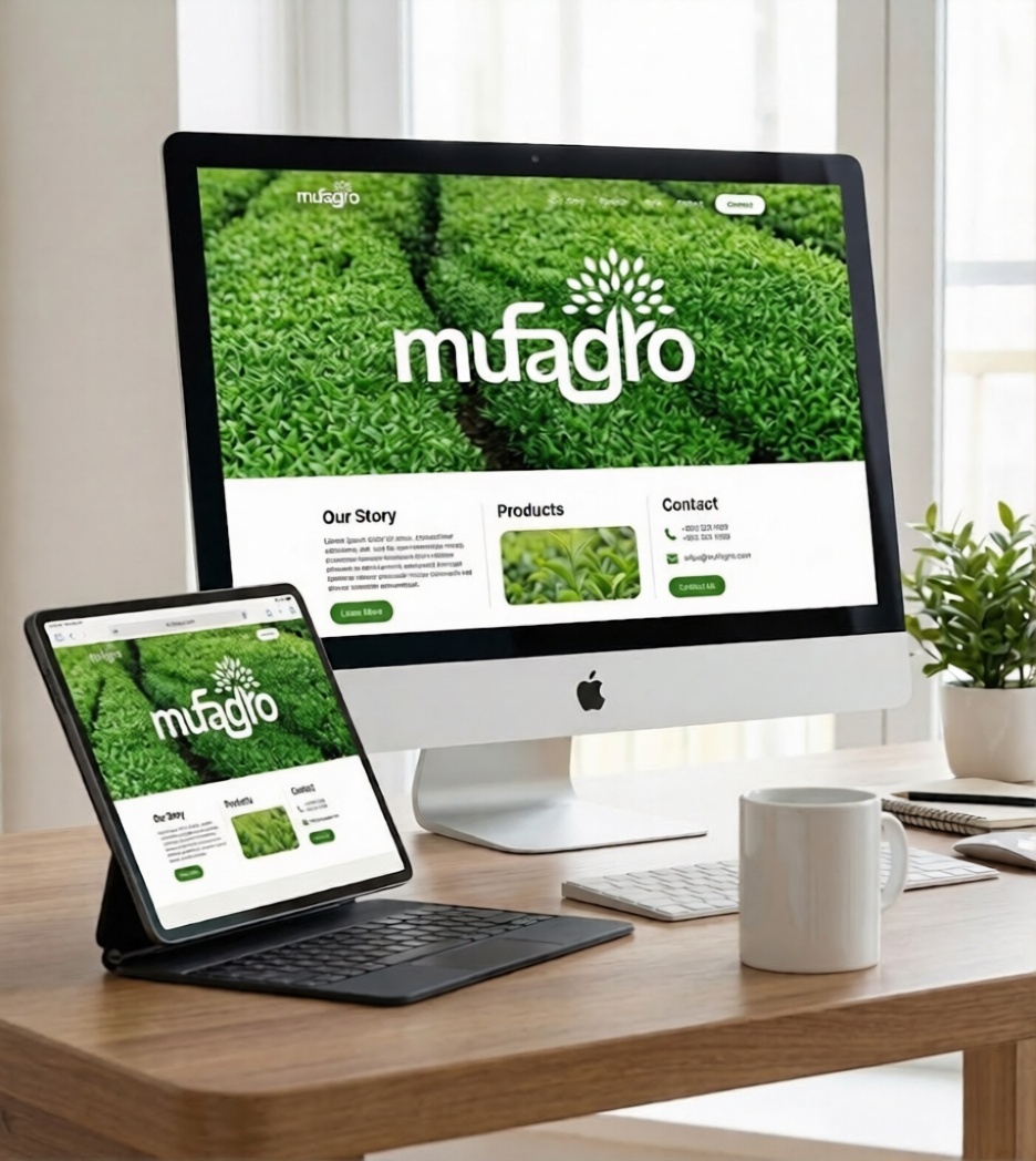
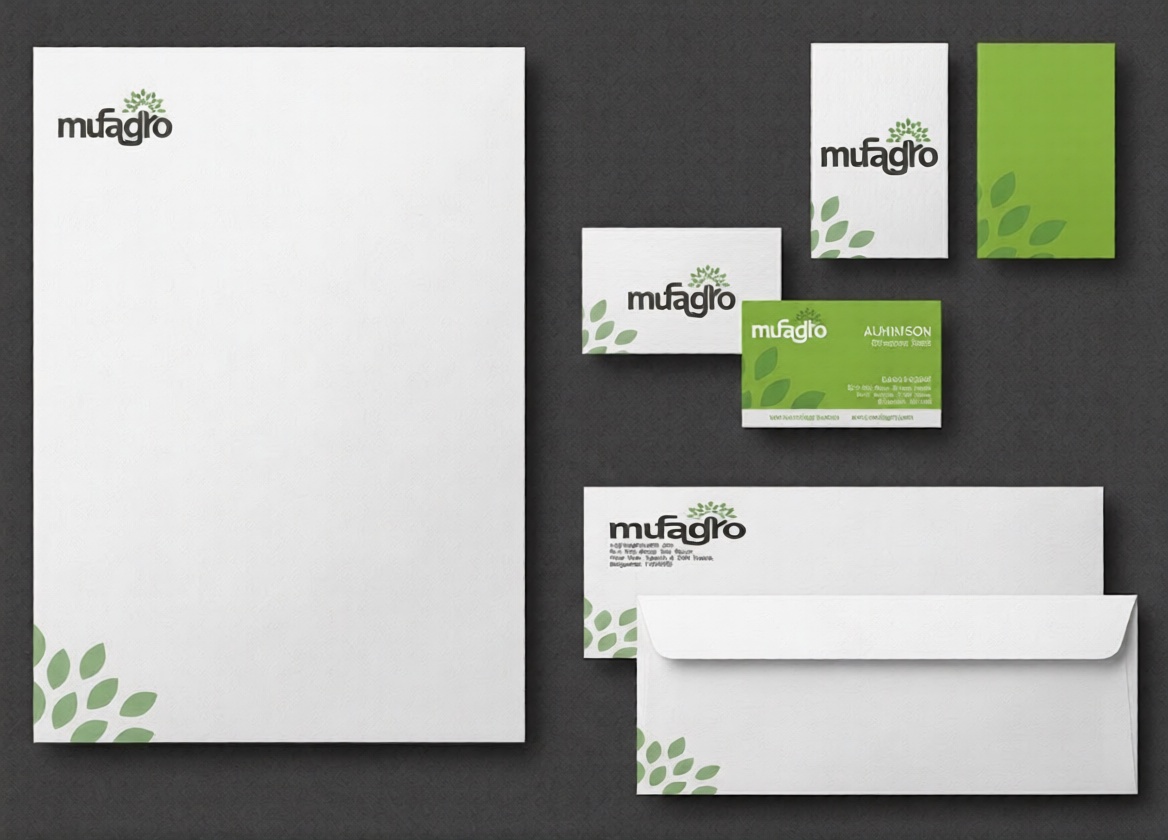
Brand Applications